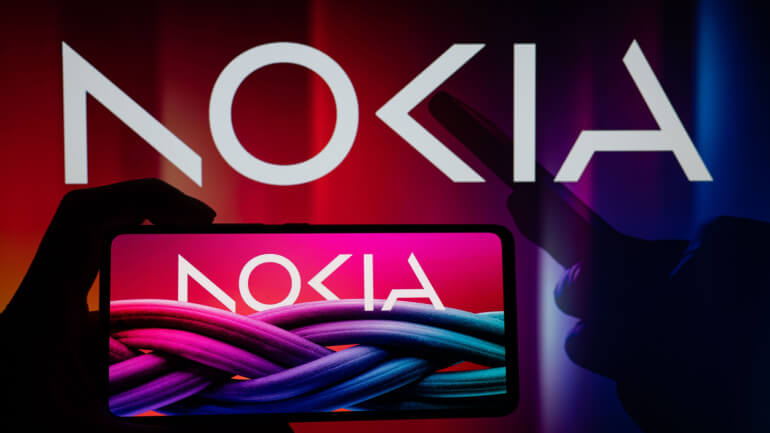
For the first time in over 60 years, Nokia, the Finnish manufacturer of telecom equipment, has unveiled its redesigned logo and brand identity. This shift underlines Nokia’s focus on fast expansion and its move away from the smartphone market towards corporate technologies.
The new logo is made up of five distinct forms that create the word NOKIA, with the customary blue color of the previous logo being replaced with a variety of colors depending on the application. Nokia’s CEO, Pekka Lundmark, stated that the company’s focus had switched from selling equipment to telecom operators, to selling equipment to enterprises.
The company intends to expand its service provider business, although its primary focus is currently on selling equipment to non-telecom businesses. Lundmark also stated that he plans to reassess the growth paths of Nokia’s various businesses, including divestment strategies if required. Nokia intends to expand into factory automation and data centers, putting the company in direct competition with major technology giants such as Microsoft and Amazon.
India is now Nokia’s fastest-growing market, and Lundmark anticipates a rebound in North America in the second half of the year. Nokia’s competitors, such as Ericsson, have also seen demand for high-margin regions such as North America decline, with growth in low-margin India replacing traditional markets.
It makes sense for Nokia to rebrand in order to ease the company’s concerns that it is still perceived as a vendor dominated by smartphone sales. The company is set to enter its second stage of expansion with the new brand identity and logo.
“Today we share our updated company and technology strategy with a focus on unleashing the exponential potential of networks – pioneering a future where networks meet cloud. To signal this ambition we are refreshing our brand to reflect who we are today – a B2B technology innovation leader. This is Nokia, but not as the world has seen us before,” said Nokia’s CEO, Pekka Lundmark.


